


When More is More: Product Page Refresh
Overview
With a major eCommerce platform migration underway, it was crucial for Global Healing to enhance the user experience and drive conversions. This transition provided an opportunity to standardize and streamline the product page design, consolidating two separate templates into a single, cohesive layout. A data-driven approach was adopted, utilizing market research and customer satisfaction data that revealed health-conscious shoppers struggled to find key information for confident decision-making. By strategically reorganizing content, prioritizing educational elements, trust signals, and clear calls to action, and conducting A/B testing on the new design, a more intuitive and seamless shopping experience was created. The updated layout made it easier for users to access product benefits, ingredients, and usage details, empowering them to make informed purchase decisions. This transformation not only improved usability but also aligned with business objectives, balancing education with conversion optimization.
Global Healing Center
Client
Lead UX/UI Designer
Role
June 2018-December 2018
Timeline
Problem
During the transition from Magento 1 to Magento 2, Global Healing faced significant challenges with inconsistent product information, poor content organization, and a lack of clear user guidance, all of which impacted customer decision-making and conversions.
Inconsistent Product Information
Managing two separate templates led to variations in how product details were presented, making it difficult for customers to compare options.
Hard-to-Find Key Information
Product benefits, ingredients, and usage details were buried in tab formats, making it challenging for users to access essential information.
Lack of Trust Signals
Customer reviews, certifications, and credibility indicators were not prominently displayed, reducing consumer confidence.
Ineffective Calls to Action
Poorly placed CTAs created friction in the purchasing process, leading to missed conversion opportunities.
Overwhelming Content Structure
Information was not effectively prioritized, and excessive repetition led to information overload, making it harder for users to engage with the page.
The Approach
To ensure a data-driven redesign, we partnered with the Baymard Institute for a UX audit to gather initial insights into user behavior, pain points, and decision-making processes. These findings informed the development of three distinct product page variations, each designed to address key challenges identified through the research done below:
Analyzed heatmaps and scrollmaps from 25 top-selling product pages to identify user engagement patterns.
Conducted surveys with over 300 customers to gain insight into their decision-making priorities.
Evaluated customer feedback to pinpoint specific gaps in product information.
Discovery & Research
User Testing
Building on insights from the Baymard Institute, two alternative product page designs were created for multivariate testing to refine the redesign further. Three distinct layouts were launched and tested over a three-month period to determine which design achieved the highest conversion rates.
Page A
-
Maintained the existing product page as a control with a new add to cart function.
Page B
-
Featured the new brand redesign with a more concise, scannable layout, consolidating key information for improved readability.

Page C
-
Displayed the redundant information from the existing product page tabs, restructuring content based on a direct competitor’s successful model.

Key Insights
The evaluation by Baymard Institute, alongside internal strategies and insights, identified key areas for improvement. Testing provided valuable data that guided the final product page design, with Page B and Page C outperforming the original layout, offering clear direction for optimization. Key findings included:
Users Value Detailed Information
-
Customers highly valued detailed information about ingredients and health benefits but had difficulty accessing it efficiently through tab structure.
Users Revisited Pages Before Purchasing
-
Customers frequently revisited the same product pages multiple times before purchasing, highlighting the need for improved information organization.
Users Don’t Mind Repetitive Information
-
Similarly, users are willing to engage with repetitive information as long as it is presented in a short and concise manner.
High-Quality Photography Builds Trust
-
Users showed higher trust and engagement with product pages that featured high-quality product photography, highlighting the importance of visual authenticity in building consumer confidence.
Users Scanned Content Details
-
Users performed better with clear hierarchy and bullet points, as they scanned for specific information first and often missed key details in dense paragraphs without clear structure.
Inconsistent Templates Impact Conversions
-
The dual template system resulted in inconsistent user experiences, causing conversion rate fluctuations of up to 18%.
Design Solutions
Unified Product Page
We leveraged the respective insights by combining both Page B and Page C into a unified experience:
Unified Template
Replaced the two existing product page versions with a single, consistent template to reduce user confusion and streamline updates.Improved Add to Cart Experience
Redesigned the top section of the page to present essential purchase details, such as free shipping and quantity selection, above a product description. This cleaned-up layout made key information more visible and accessible, addressing pain points in the previous design where users had to scroll or hunt for these details.Sticky CTA
Made the “Add to Cart” CTA persistently visible, giving users direct access to the purchase path at any stage in the discovery and decision-making journey.Prioritized Information Architecture
Restructured content to surface key decision-making information first. Repetitive content was visually differentiated using stylized product photography and iconography.Scannable Content
Although the redesigned page became longer, we presented content in a concise and digestible format. Users demonstrated a willingness to scroll when content was relevant and clearly organized. Dense paragraphs were broken into bullets, sectioned layouts, and visual blocks for easier scanning.Enhanced Visual Hierarchy
Implemented clear typographic and spatial hierarchy to distinguish sections, guiding users through the page seamlessly.Evidence Prominence
Elevated scientific evidence, certifications, and trust indicators to appear above the fold, reinforcing product credibility early in the experience.
Hover for comprehensive view
Implementation Strategy
A phased implementation plan was developed to ensure an efficient rollout of all product pages while facilitating cross-team collaboration:
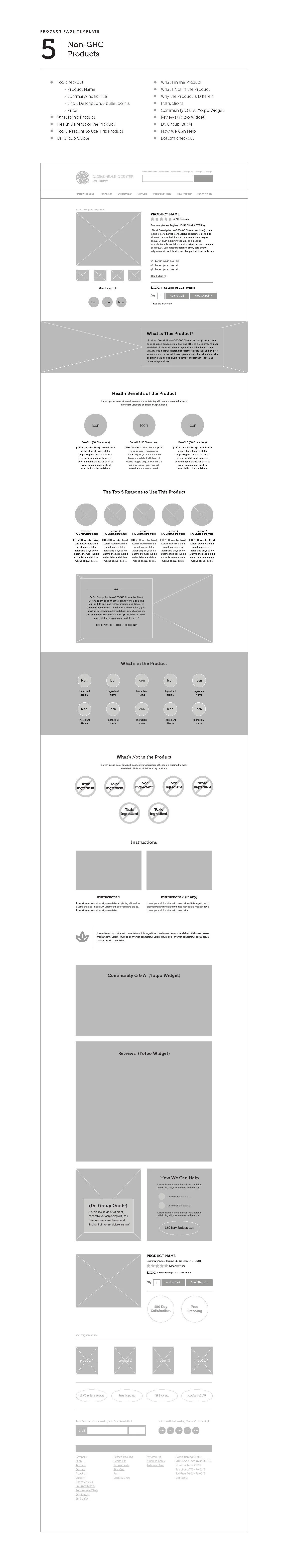
Product Page Templates
A standardized product page template was applied across five distinct product groups, streamlining implementation and maintaining consistency.


Collaborative Development
Worked closely with the development team to create detailed design specifications for the Magento 2 environment. The templates were built using modular components, allowing for flexibility and easy adaptation across different product types.
Enhanced Analytics for Continuous Optimization
Integrated advanced analytics to track key performance metrics and gather insights for ongoing improvements within the new platform.
Impact & Results
The redesigned product pages delivered measurable improvements to the business.
18%
Conversation
Rate Increase
32%
Reduction in Customer
Service Inquiries
18% increase in product page conversion rates in the first 60 days after launch
36% reduction in customer service inquiries about product information
21% increase in average time on page with more scrolling activity to key information sections
Positive customer feedback specifically praising the improved information clarity
The insights challenged our initial assumption that our audience preferred shorter, more concise content. Instead, the data revealed that they were willing to engage with more in-depth information when presented effectively. By combining Baymard’s research expertise with A/B testing and customer insights, this project reinforced the value of data-driven design decisions. The result was a product page experience that successfully balanced business objectives with user needs. Most importantly, this process highlighted how aligning UX improvements with technical migrations can maximize impact while optimizing resource allocation.