


Providing Members with Better Access to Resources
Overview
Child Care Providers United (CCPU) was facing a dual challenge: their website made it difficult for members to find location-specific information like local office contacts and union representatives, while also failing to mobilize and energize their community ahead of a major election. The outdated design and poor information architecture overwhelmed the main office with calls, and left the team with a site that was hard to manage and lacked the clear, action-oriented spaces needed to drive engagement for their campaigns.
Agency
Child Care Providers United
Client
Lead UX/UI Designer
Role
July 2025-October 2025
Timeline
Problem
The Child Care Providers United (CCPU) website was no longer meeting the needs of its users or supporting the organization’s mission. Members across different regions faced consistent challenges when trying to access essential resources, resulting in operational inefficiencies and user frustration. Key issues included:
Key Problems Identified
Lack of Accessible Information: Users struggle to find location-specific details such as local offices and union representative contacts.
High Call Volume: The main office receives an overwhelming number of inquiries due to the website’s poor navigation, slowing down operations.
Outdated Design: The website’s outdated layout and user interface create a frustrating experience for members.
Poor Information Architecture: Essential resources are difficult to locate, preventing users from accessing the support they need.
Union’s Goal Misalignment: The current website fails to provide a user-friendly digital space that supports both current and future members.
Need for Redesign: A new website structure is required to improve navigation, enhance search functionality, and deliver a seamless user experience.
The Approach
To ensure the redesigned CCPU website effectively serves its users, we conducted a collaborative discovery workshop to identify key user personas including child care providers, union representatives, and prospective members and surface their distinct pain points and priorities. Working within CCPU's existing brand colors and logo, we explored visual direction through a comparative design exercise, examining existing websites to capture aesthetic preferences and establish a refreshed look and feel that aligned with their identity.
Discovery & Research Workshops
Understanding User Personas
To ensure the redesigned CCPU website effectively serves its users, we conducted a collaborative workshop to identify key user personas and their specific needs. By understanding the different types of users such as child care providers, union representatives, and prospective members, we were able to define their pain points and prioritize the most essential information, ensuring the site structure aligned with their expectations.


Look and Feel Exploration
During the workshop, we also analyzed competitor websites, walking through what participants liked and disliked about various designs. This hands-on approach helped us refine the visual direction of the new website, ensuring it aligned with user expectations while improving overall accessibility and usability. The insights gathered directly shaped the website’s structure, navigation, and design, creating a more intuitive and engaging experience.

Design Solutions
Information Architecture
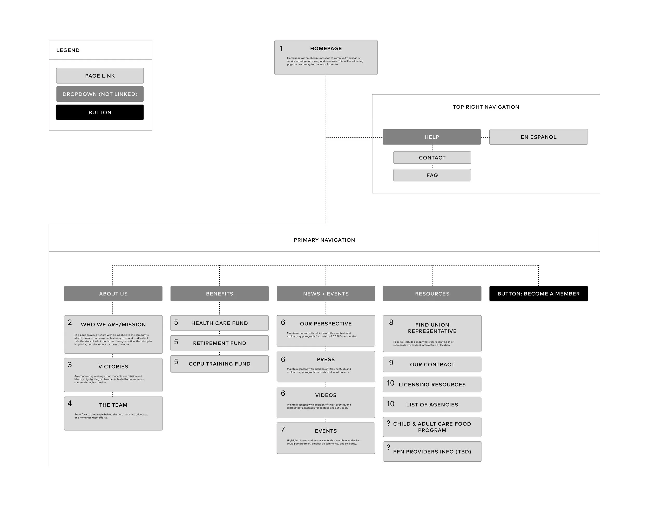
Using the key takeaways from the workshop, we developed a streamlined information architecture tailored to different user needs. By implementing clear navigation pathways and intuitive content organization, users are efficiently directed to their appropriate pages, whether they are searching for local office details, union representative contacts, or key resources. This hyper-focused approach minimizes information overload, reduces unnecessary interactions, and ensures that each visitor receives the most relevant and accessible information, ultimately improving engagement and operational efficiency.
Wireframes

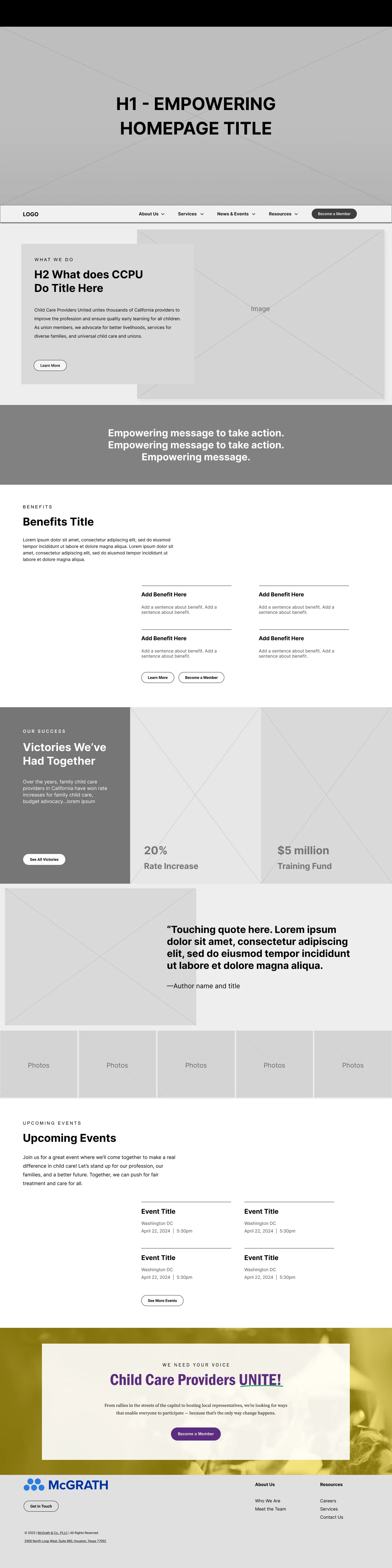
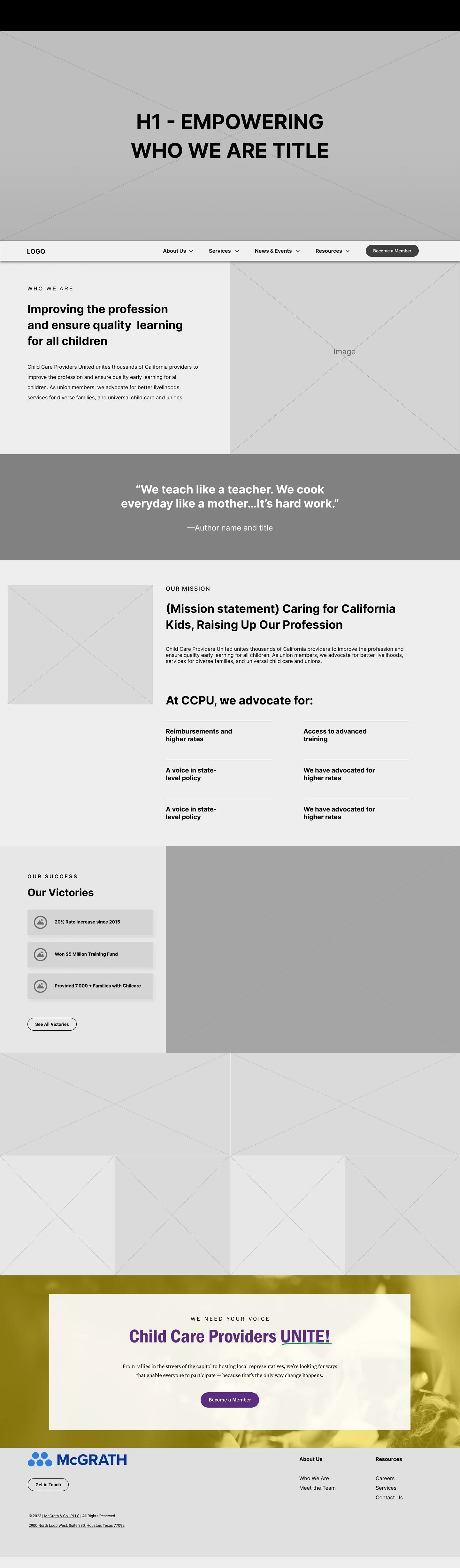
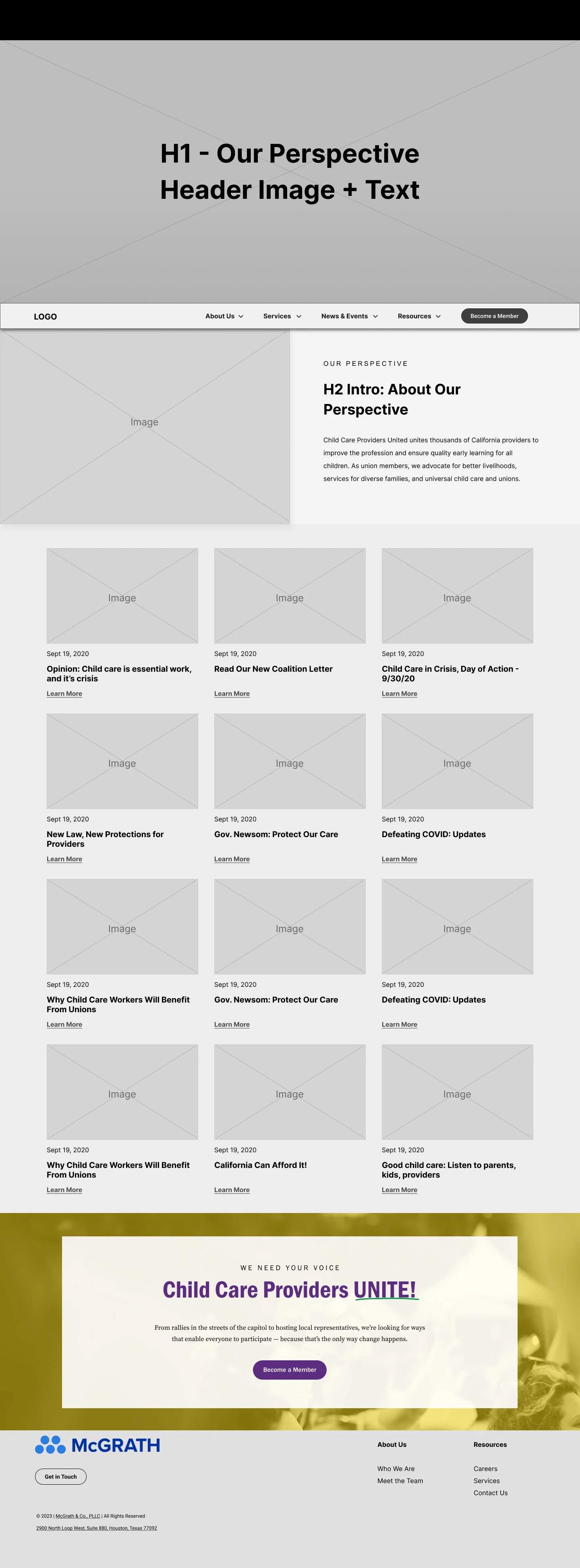
The low-fidelity wireframing process played a crucial role in structuring the redesigned CCPU website. By focusing on layout, user flow, and information hierarchy, I was able to quickly test and refine navigation pathways before moving into high-fidelity designs. These wireframes served as a blueprint for streamlining content, ensuring that different user groups could efficiently reach their designated pages. Prioritizing clarity and usability early in the process allowed for iterative improvements, aligning the website’s structure with user needs while maintaining a seamless and accessible experience.
Hi-Fidelity Prototype
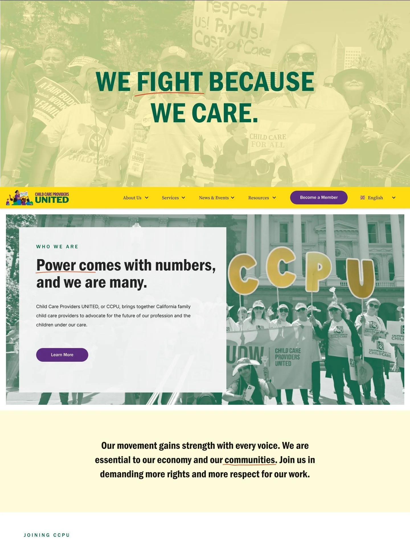


Building on the foundation set by the low-fidelity wireframes, we transitioned into high-fidelity prototypes by refining the visual design and incorporating elements that evoke empowerment, excitement, and inspiration. We introduced a bold, bright color palette to energize the user experience and create a sense of movement and advocacy.
To reinforce the grassroots nature of the organization, we integrated authentic photography from the field, capturing real moments from CCPU’s events and community efforts. Additionally, we incorporated hand-drawn elements, reflecting the handwritten signs used during rallies and gatherings, adding a personal and human touch to the design. This combination of vibrant visuals and organic elements ensures that the website not only informs but also emotionally connects with its users, reinforcing CCPU’s mission and community-driven spirit.
Results
The redesigned CCPU website empowers organization members to confidently direct users to the resources they need, backed by a streamlined and intuitive experience. Well-received by the internal team, the site is already functioning as a valuable resource for the union, and as it continues to grow, we look forward to seeing how it will further contribute to member satisfaction and smoother operations.